Colour Stories: Cerulean — Cultured Calm
“It’s not just blue, it’s not turquoise. It’s not lapis. It’s actually cerulean”

The line that launched a thousand memes - but beneath the satire is a truth luxury designers have long understood: colour is a cultural signal. And few tones carry as much quiet power as cerulean.
Cerulean: that quietly commanding shade of blue, has evolved into a colour of emotional clarity, worldly calm and refined elegance. It’s the antidote to sensory overload. A designer’s go-to for serenity without sterility. And in the world of high-end hospitality, it’s increasingly becoming a visual shorthand for curated intelligence and effortless cool.
Where Cerulean Lives in Luxury Hospitality
Cerulean has taken root in some of the world’s most memorable luxury spaces and it’s no coincidence. It’s a colour that soothes without softening a brand’s edge.
The Rooftop at The Berkeley


Perched above Knightsbridge, plays beautifully with a pale, summer-soaked blue. The pool glistens against the sky, with seating that blends cerulean and off-white tones - a masterclass in heat-appropriate design that still feels elevated.
Just below, The Blue Bar at The Berkeley - created by the legendary David Collins Studio, remains a cult classic of hospitality design. Now closed, but never forgotten, its vivid, lacquered blue walls gave moody maximalism a timeless twist.
Deep Blue Restaurant by Contacto Atlântico

In Portugal, Deep Blue Restaurant by Contacto Atlântico wraps cerulean into its very foundations, quite literally. The space is lined in traditional Portuguese blue and white tiles, reimagined in bold geometric form. It’s local heritage translated into something fresh, modern, but emotionally rooted.

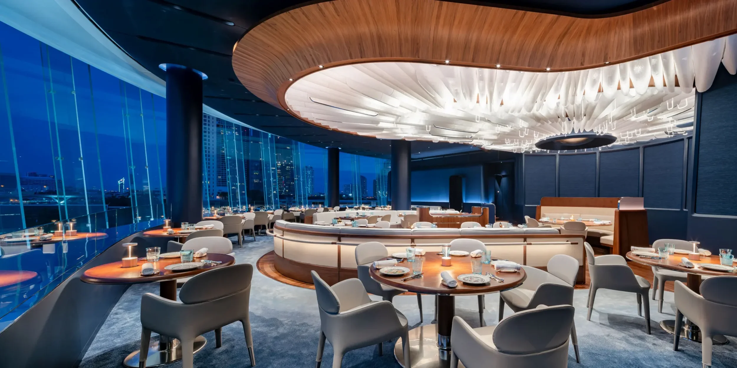
Blue by Alain Ducasse
Blue by Alain Ducasse in Bangkok leans fully into the colour’s cultural weight, pairing it with gold and lacquer for an atmosphere that is both opulent and calming.
Bidendum
In London’s Chelsea, Bibendum, originally opened by Sir Terence Conran in the historic Michelin House, offers a more architectural approach to cerulean. The restaurant’s midnight-blue carpeting, velvet seating and stained-glass windows in rich blue tones create a palette that feels both grand and grounded. Paired with soaring ceilings and light-flooded Art Deco features, the use of deep blue adds a sense of quiet drama, proof that even the richest shades of cerulean can be used to soften, rather than overwhelm, a space.

Le Train Bleu
And while cerulean often takes centre stage in modern spaces, sometimes it’s the supporting role that speaks loudest. At Le Train Bleu in Paris’s Gare de Lyon, deep navy furnishings set against gilded Belle Époque murals offer a masterclass in theatrical contrast, a reminder that blue, even when quiet, can anchor a whole story.

Cerulean as Brand Strategy
For hospitality brands, especially in the modern luxury space, colour is more than a palette - it’s a positioning tool.
Cerulean signals a space that understands nuance. It feels curated, calming and considered. The kind of place that trades in experience rather than excess.
So the next time you scroll past a hotel pool, a spa suite or a luxury lounge and feel inexplicably at ease - look again. You might just be under the spell of cerulean.